SketchUp Link:
https://3dwarehouse.sketchup.com/model.html?id=uae7d5187-0adc-493f-aad4-9611f816b41b
Lumion Link:
https://www.dropbox.com/s/4ag86gao89qx2b8/Arch1101%20Completed.sva
Monday, 30 June 2014
Lumion Captures
Unfortunately, Lumion crashed when the video was uploading and all data on the landscape was gone. Therefore i had to recreate the landscape and hence, in some areas, might appear different than in the previous images in the blog.
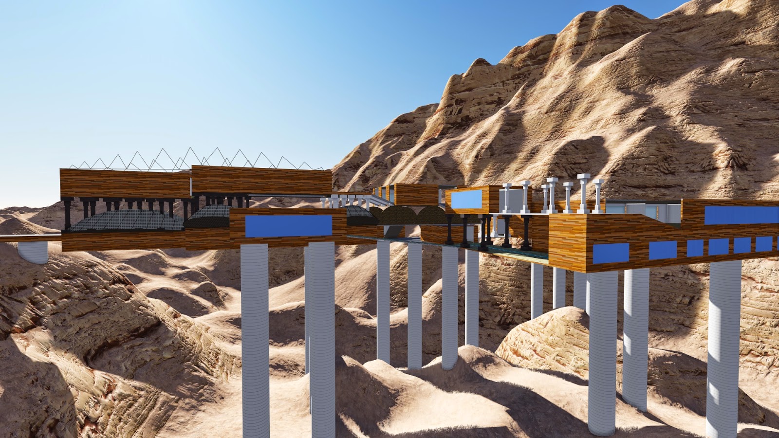
When entering the Architecture School this is immediately what you would see. The massive bridge up ahead with columns beaming out of it and large constructs erected from all sides of it. (The greyish/blueish colored rectangles the appear on most walls are in fact translucent windows however in Lumion they appear solid)
After walking in the school, the bridge immediately mixes up the architectural design through the juxtaposition of modern and traditional. The beams erected on either side of the image below represent the Greek Parthenon's columns and symbolizes a key aspect of architecture.
The image below reveals the Lecture Room and the view of the entire bridge from the very back. The Lecture Hall also addresses the key theme of modern vs traditional with the shape of the Lecture Hall being that of a Colosseum.
This image was just taken to show more columns as well as a view of the bridge looking approximately mi-way through the construct.
The Complete view of the Architecture School Bridge from a point outside the bridge itself. This image shows the length and components of the bridge from one perspective.
The last image shows the entirety of the bridge from a different perspective from that of the image above and also includes the Folly; which can be seen in almost the bottom left hand corner. this gives a sense of scale to how high the bridge actually is and the distances of different parts of the bridge.
When entering the Architecture School this is immediately what you would see. The massive bridge up ahead with columns beaming out of it and large constructs erected from all sides of it. (The greyish/blueish colored rectangles the appear on most walls are in fact translucent windows however in Lumion they appear solid)
After walking in the school, the bridge immediately mixes up the architectural design through the juxtaposition of modern and traditional. The beams erected on either side of the image below represent the Greek Parthenon's columns and symbolizes a key aspect of architecture.
The image below reveals the Lecture Room and the view of the entire bridge from the very back. The Lecture Hall also addresses the key theme of modern vs traditional with the shape of the Lecture Hall being that of a Colosseum.
Folly and Moving Elements
Folly:
The folly was taken from one of the perspective drawings and then put into the Artisan Tool Bar. the reason i did this was because the Artisan toolbar gives a more modern and futuristic look enhancing my theory of the combination between traditional (old) and the modern way of architectural design and composition. The bridge serves as the traditional (in the way of columns alluring from the idea of the Greek Parthenon) whilst the Folly represents the modern through its use of the Artisan Tool.
Moving Element 1
Moving Element 2
The Video above shows the second moving element which is basically a free guiding lift that takes you from the folly to the main construct - the Bridge. I decided to make this "lift" circular in shape and have different compartments so as to resemble different groups of friends or teachers occupying different spaces all interconnected through small pathways.
Fly Through
The video above is a quick fly through that goes around the entire bridge and shows each and every part that was meant to be designed such as the Studio Spaces and the Lecture Hall. Although there are no annotations, the description of each room and where they are located are found elsewhere in the blog.
EDIT: In the above post i mentioned the video crashed... only 14 seconds of the video actually uploaded... which is annoying. I dont really want to try it again as i might lose everything and have to redo it. For a 3rd time.
The Rooms + Rooms with Textures
Rooms With Textures
Texture 1
Texture 2
Texture 3
All the rooms within the bridge itself (W/O textures)
Library + Computer Labs
Dean's Office
Gallery (w/moving element)
Lecture Hall
Staff Meeting Space
Student Meeting Space
Academic Staff Offices
General Staff Offices
Research Room for Academic Staff
Studio Spaces (x4)
Workshop
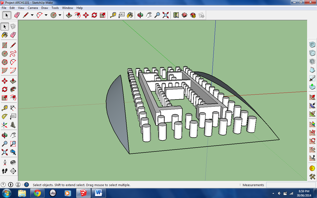
SketchUp Bridge Drafts + Ideas
The original idea of my bridge came from the Parthenon that was built in Greece in the times following the Persian Wars in 500BC. The use of columns was a particular detail that i wanted to stress in my bridge and the combination of traditional and modern designs allowed me to utilize the columns as a symbol. The columns show the connection between old and new architecture and in a school that teaches architecture, i believe that is very important - understanding how materials, design and structure have changed over time
18 Two Point Perspectives
Perspective Set 1
Perspective Set 2
Perspective Set 3
Perspective Set 4
Perspective Set 5
Perspective Set 6
Subscribe to:
Comments (Atom)


